Print marketing still has a valuable role in any marketing strategy today, so you should be dedicating ample resources, time and energy to it. After all, a boat won’t reach the shore if only half the people onboard are rowing! A critical part of ensuring your print resources have the impact you want is getting the design right.
Quality graphic design will expand your reach and maximise the amount of people your printed products attract, so carry on reading to learn more about 3 of the most commonly made mistakes when it comes to the graphic design of printed materials.
1. Designing for the wrong medium
There are many printed materials available, including posters, flyers, business cards and banners. Assuming that one design will work for all results in low quality prints with poor resolution and sizing. For example, if you simply blow up a business card design for printing on an A3 poster, you’re going to get a blurry image that’s unreadable. Create a separate design (but using the same brand principles) for each type of material you want so that each print comes out clean and of a high quality. Poster printing is a great way of spreading the word about your business and products.
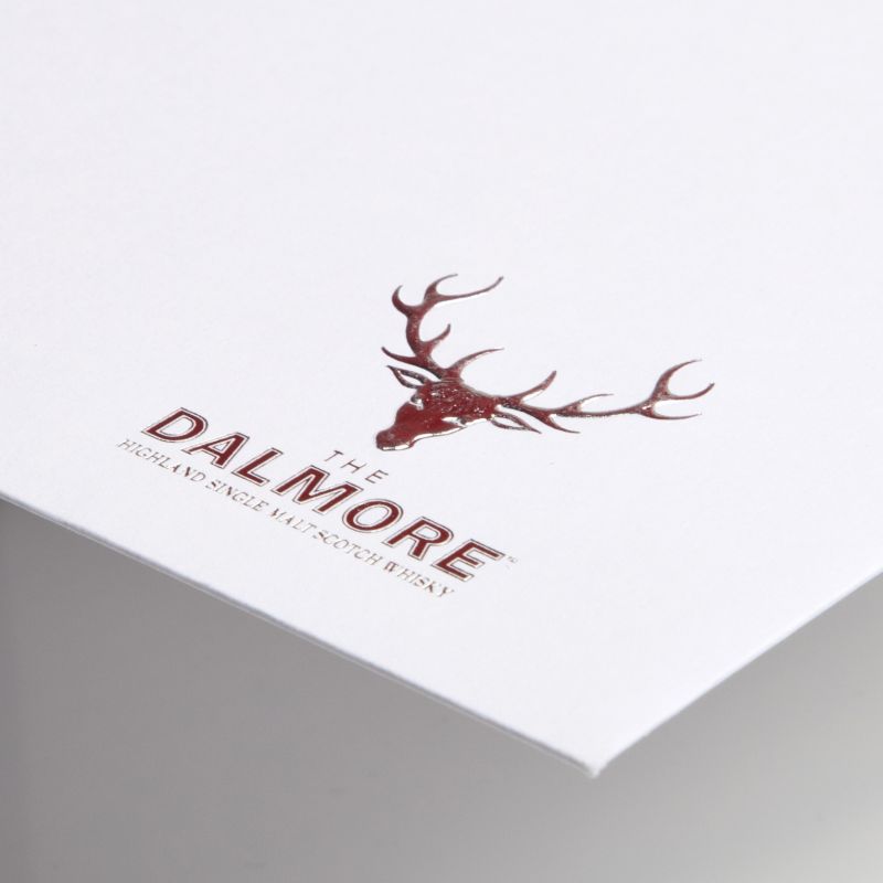
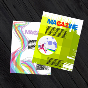
2. Using too many colours or fonts
Many of the most successful company logos and house styles are popular because they are simple. It can be tempting to assume that the bolder and brighter a printed material is, the more attention it is going to attract. However, the downside to this is it may be off-putting to some and confuse others. Instead, stick to only a few company house colours and one or two legible fonts.
3. Ignoring the Hierarchy of Design
There are many theories about graphic design you should keep in mind when designing printed products. One of these is the Hierarchy of Design. This theory considers the way that each element is arranged so that the audience’s attention is attracted to the most important parts first; for example, by putting the most important information at the top of the page or by affording it more room on the design. There are many ways to create a design hierarchy, including font size, placement, colours and more.
You can find out more about the design hierarchy theory by Coreldraw: Hierarchy in Graphic Design: Understanding What it Means and How to Use It
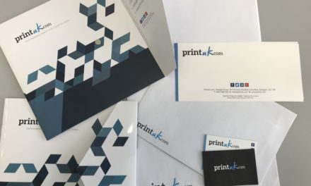
Use PrintUK.com today
If you’re in need of some quality printed resources for your business’s marketing and networking strategy, look no further than PrintUK.com. Our printing products can be customised bespoke to your branding and marketing needs, resulting in the perfect printed materials every time. Get started today by browsing our popular products.

.jpg)
.jpg)
