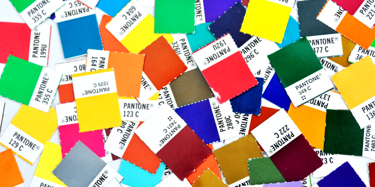
Ever wondered what attracts you to an advert/poster, the first thing that will draw your attention will be the COLOUR. Colour has an enormous effect on our attitudes and emotions because when our eyes take in colour they communicate with a part of the brain called the hypothalamus which sends a message to the pituitary gland which sets off an emotion. Ever ‘Seen Red’ or ‘had the Blues’? been ‘in the Pink’!
Colour has a powerful psychological influence on the human brain, mentally, physically, consciously and subconsciously. These responses to colour can be used to the advantage of marketeers to illicit the desired response to their marketing campaigns.
Consider the grey sky and the dark days of winter opposed to the bright blue of summer, the affects on our well-being are well documented. Red and Green, ‘society and nature’ have been wired deeply into our subconscious that no two other colours have such opposing meanings. The most obvious example of this is traffic lights, this combination is used worldwide. Sometimes the connection is not so obvious but Red is often used to reject, disagree, remove, close, cancel, no etc… Whereas Green is a positive colour associated with yes, accept, go, add, agree…Words often just clarify the meaning.
We talk of primary colours being red, blue, green and yellow, Colours are also considered to have a temperature. Warm colours being from pale green through yellows to deep red and cool colours from dark purple, blues to dark green.
The use of colour can also have links to the activity or product that is to be promoted, such as gardeners will often use earthy colours like green, brown and yellow. We associate chefs with white aprons or black and white stripes.
Understanding how the mind works is an important integral part of marketing.
According to a Webpage FX info-graphic, “people make a subconscious judgement about an environment or product within 90 seconds of initial viewing. Between 62% and 90% of that assessment is based on colour alone”.
Consequently, it’s extremely important that you consider the colour palette of your brand before printing your corporate brand material whether that’s internal newsletters or company letterheads. To help you do so, listed below are our top colour psychology tips that you can implement within your company’s leaflets, brochure design and printing as well as your business card designs:
1. Investigate your industry’s colours
When you look at the business cards and websites of different companies you’ll begin to notice that businesses which operate within the same field of industry utilise similar colour schemes. This is no coincidence; businesses opt for particular colours because they invoke certain feelings for customers. For instance, blue is the predominant colour used by social networking sites, such as Twitter, Facebook and LinkedIn, due to its subconscious associations with logic, calm and communication. As Karen Haller, a business colour and branding expert states, “blue relates to the mind, so consumers associate it with logic and communication. It’s also serene, like the ocean, and calming to look at”. Consequently, before designing your printed material you should investigate the predominant colour schemes associated with your industry and incorporate these tones within your design.
2. Use primary colours for calls to action
A study by Kissmetrics [Psychology of colour and conversions] revealed that the highest converting colours for calls to action are bright primary and secondary colours such as red, yellow, orange and green. Due to the fact that these vibrant colours attract attention, it’s useful to incorporate them within your business card design and website calls to action in order to capture the interest of your key consumers and to encourage them to investigate your brand in greater depth.
3. Be consistent
From your business cards to your company website, it’s important to promote cohesion and unity with all aspects of your brand’s overall design. As we discussed in one of our previous blog posts, “this kind of comprehensive coverage strengthens your brand identity, and makes it more recognisable to your customers” Blog Post: 3 Colour Design Tips for Creating Fantastic Leaflets. For example, when you’re designing your business cards, you should aim to incorporate colour schemes and design traits that currently exist within your company website’s graphic design. By doing so, you can begin to establish your brand’s reputation and its subconscious colour associations within the minds of your key consumers. Although this may seem like a minor aspect of your direct mail and digital branding strategies, over time it could earn you the loyalty, recommendations and return custom of a broad consumer base.
Remember: Colour is incredibly powerful in marketing because it can instantly change a persons actions or thought process. Use wisely.
How colour psychology can be used to successfully promote your brand

.jpg)
.jpg)

Trackbacks/Pingbacks