When designing a poster for print, it is important to know that most people will not spend more than a couple of seconds looking at it. That is all the time you get to entice your audience. You will need to be able to deliver that information in a very short amount of time. Ideally, a printed poster should be able to give passers-by all the information they need about your event and be aesthetically interesting enough to catch their eyes.
Effective printed posters always have these three traits:
1. They look professionally-printed
2. All information is accurate and everything is spelled correctly
3. All important information is visible from a distance
Here are some tips on putting together a poster that will be visible, even among many others.
1. Balance the Composition
If you are not a trained artist or graphic designer, then balancing a poster’s composition may be a bit more difficult. When you are composing a poster for print, you want it to work within the confines of basic two-dimensional composition art rules. Graphic designers generally have these rules down to a T, but even an untrained artist can follow their lead.
Find a poster you like and mimic the layout. Gather all of your information and images, then map out a design that works. Try to have a healthy balance of text and images.
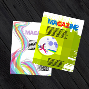
2. Keep it Simple
When it comes to poster design, less is more. This principle is especially applicable to posters! Do not dull your text by crowding it with unnecessary images or information. Stick to one color palette; try to mix of two different, bright colors and a neutral. If you have trouble coming up with an effective color palette, Janie Kliever put together a great collection of poster color schemes here. : 100 Brilliant Color Combinations and How to Apply Them to Your Designs
On the same note, do not be afraid of utilizing white space! While you definitely need to get your text information in there, keeping your poster design extra-simple may just help it stand out among the rest.
3. To Sans or Not to Sans, That is the Question
If you are unfamiliar with the terms serif and sans-serif, they are the most basic classifications of text font. A serif has a small protrusion from each letter, while sans-serif fonts look more modern. Serif fonts are great for headlines if you do not have design experience. They will give your poster a more traditional look. Use a sans-serif font for all the smaller text in your poster.
Avoid all overly-embellished fonts like the plague. They are a design disaster.
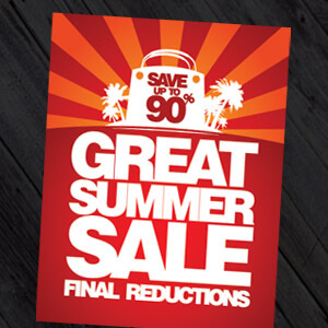
4. Use a Text Hierarchy
Use different font sizes in your poster, so people can easily tell what information is the most important. This also helps to draw the viewer’s eye across the poster, ensuring that it will at least get looked at. Try to allign your text sizes in a pyramid or upside-down pyramid, meaning that the largest size text would be at the top and the smallest at the bottom, or the smallest would be at the top with the largest at the bottom.
5. Know your Quality Levels
Make sure that all the images you use have high resolution and that all the text looks fluid. A great layout can be completely ruined if the poster ends up looking pixelated. It is also important to remember to export your poster in at least 300 DPI, for optimal poster printing quality, or it may fall apart during the printing process. If it is possible, go to a professional local printer to have your posters processed as well. If you use a personal home desktop printer for your posters, you run the risk of a very poor print quality.
If you’re looking for more information on logo colour combinations then check out this great article: 35 Logo Color Combinations to Inspire Your Design
Jessica Kane is a professional writer who has an interest in graphic design, marketing, and printing. She currently writes for 777 Sign, her go to place for banner signs, custom flags and custom signs printing.


.jpg)
.jpg)
Trackbacks/Pingbacks