Print design tips and tricks to make an impact even when money is tight.
Introduction
Whether you design in-house or outsource to a print and design specialist, it pays to have a few tips and tricks up your sleeve in order to make a great impact even when money is tight. Most high quality printing services will help assist you in the design of your print and here at PrintUK.com we offer thousands of design templates to help you achieve your goal.
Space is your friend
The gaps between what you say are just as important as the message itself. Allow text to breathe. Don’t cram too much into your design. Use white space to surround your headlines and subheadings and make paragraphs easier to read. That way readers will be able to focus on the points which really matter.
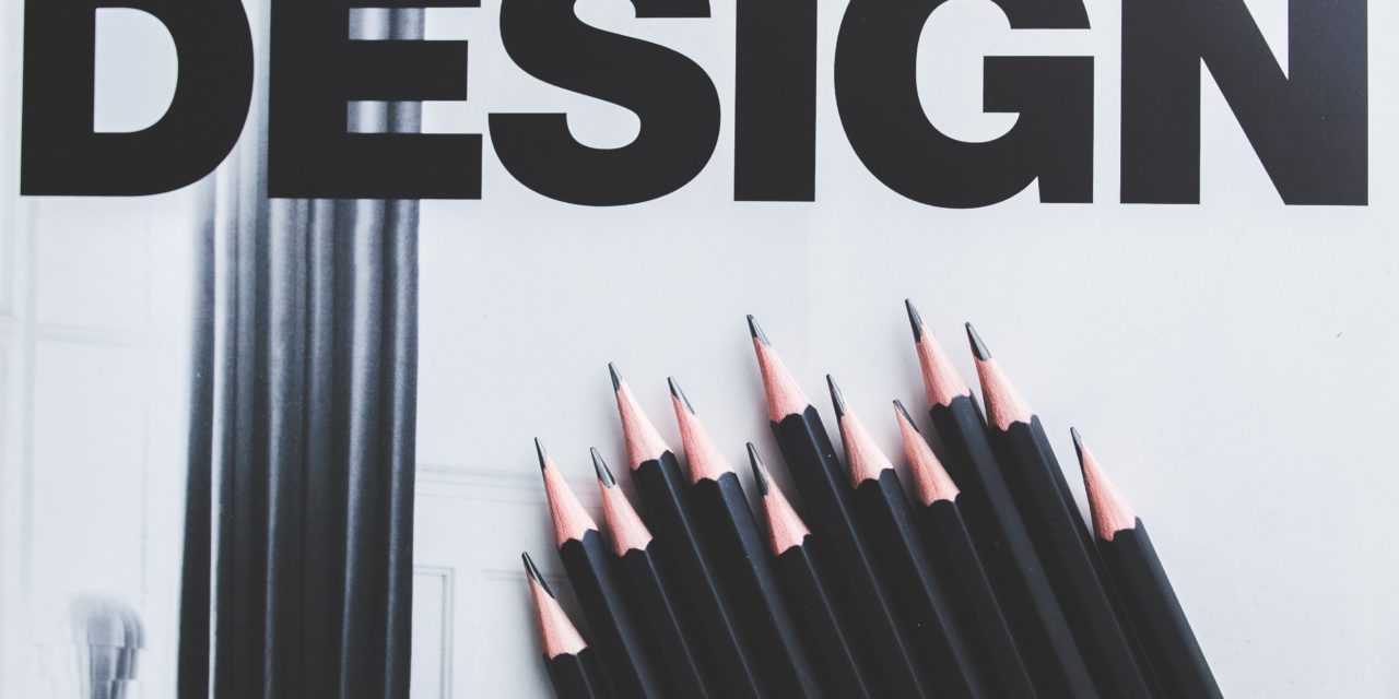
Keep fonts simple
You only have to take a look at the advertisements that clutter community noticeboards and social media sites to see that mixing multiple fonts, letter spacing and sizes complicates design. Limit yourself to two simple fonts. Mix up serif and sans serif if you like. But stay consistent. If you are struggling, pick up a newspaper and study how they do it.
Living off grid
Even novice designers can provide professional results by using a good grid system. Grids don’t have to be complex and you can create them yourself. Simply set up a single page layout and then duplicate it for a multi-page document. Brochure printing is a great way to showcase your products and services just keep ion mind a grid system on your page. Once you understand the importance of grids you are better placed to brief designers too.
Snap happy
When taking or selecting photos for use in your publicity materials, reports and other print items choose neutral backgrounds and bold subjects that bounce off the page. Complex images including crowd scenes can be as confusing as dense text. Think about strong composition using the rule of thirds, a technique enabling you to position the important elements of your image where they will carry the most impact.
It’s a colourful world
You might want to reflect the colours of your brand in your design. If not, there are lots of websites exploring the way different colours are perceived. Reds can symbolise danger or energy. Greens and browns are often seen as ‘natural or ‘earthy.’ Black against yellow is highly readable and ideal if you are reaching out to elderly or visually-impaired audiences. Don’t settle for random colour schemes. Choose no more than two or three base colours and make them work for you.
And finally, don’t forget to include a call to action somewhere in your content.
Why not get in touch with PrintUK.com today for a friendly chat about how we can help you!
5 Simple Design Tips that Pay


.jpg)
.jpg)
