Leaflets are a great way to get your business out there and interact with potential customers. Whilst most businesses find it easy to get the design elements of their leaflets right, some have trouble with using colour effectively. To help your business get it right, we’ve put together a list of of three tips for using colour in your leaflets.
1. Get the combination right
Using colour effectively is all about getting the combination right. How many marketing leaflets do you get through your letterbox where the colour combination makes your eyes hurt? You don’t want your leaflet to be one of those. Try mixing and matching a range of different colours before committing to a combination, that way you can make sure the colour combination works before you start your leaflet printing.
2. Use your brand colours
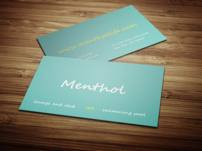
If you’re stuck for ideas on how to use colour in your leaflets, then why not just use your branding colours? Many businesses don’t realise that as well as being tools for marketing, leaflets are also a great way to get your brand out there. In order to make your brand as strong and recognisable as possible, you need to make sure that you include your colours across all aspects of your business, from your website and blog, to your brochures, leaflets and business cards. This kind of comprehensive coverage strengthens your brand identity, and makes it more recognisable to your customers. Once you’ve decided on the design elements of your leaflet, you should try branding it out in a few different ways, using different colour combinations from your branding. This way you can make an informed decision on which colours work best to make the leaflets instantly recognisable as a part of your brand.
3. Don’t overpower your message
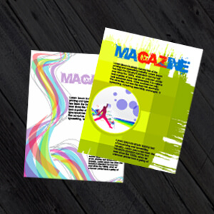
The main thing to remember when using colour in your leaflets is to make sure that it doesn’t overpower or obscure your message. Time and again brands throw too much colour at a leaflet or brochure, and in the end all it does is detract from the message by overwhelming the reader or making the text unreadable. For colour to be effective it needs to complement what you’re trying to say without drawing attention away from it.
If you are looking to improve your brand awareness and want more tips on how to make your leaflets stand-out from the crowd then checkout these articles:
Five ways to make your flyers stand-out from the rest!
Top 10 leaflet Design Tips – to help you design the best leaflets.
PrintUK.com
T: 0845 2993 923
E: Hello@PrintUK.com
3 Colour Design Tips For Creating Fantastic Leaflets


.jpg)
.jpg)

Trackbacks/Pingbacks