
Four years ago, a certain dress hit the headlines, dividing opinion and – in some cases – causing rifts between friends and family. Blue and black or white and gold? It was almost impossible to understand how the same dress could be seen by different people in different ways.
The way that humans see colour is not as clear-cut as you might imagine. Most would agree that an apple is red, but it’s easy to assume (but completely untrue) that the red you see is exactly the same as the red that someone else sees. Light receptors in the human eye transmit messages to the brain to interpret, but how those messages are received and understood varies from person to person.
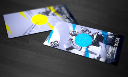
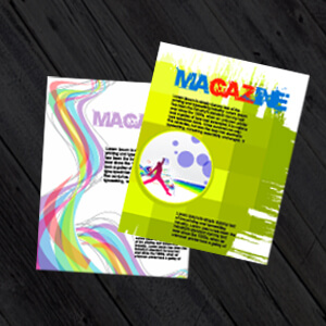
Colour, therefore, is important to human existence and, when you’re designing a marketing strategy for your business, it’s vital to consider its potential impact on customers – and to understand their perceptions of your brand from the colour scheme that you choose. Brochure printing, for example is a fantastic way to connect with your customers, but when designing it you must think carefully about colour!
Red
A powerful and visually stimulating colour that is associated with many global brands, red oozes passion, energy and excitement. Red is a statement of intent, sometimes tinged with rebellion or innovation.
Blue
Popular in the corporate world, blue is a popular and trustworthy colour that is associated with efficient, dependable brands. These organisations, including government agencies, are perceived to operate smoothly, proving themselves responsive and reliable.
Green
If your business or brand is health or environment-focused, then green is the obvious choice, symbolising peace, harmony, good health and relaxation.
Orange
An appealing colour that radiates warmth, value and confidence, brands that feature orange are often perceived to be at the cutting edge of their field, forward-thinking and cost-effective.
Pink
Pink is often associated with feminine brands but can be used equally for any business that wishes to promote itself as fun, engaging and edgy. Pink is definitely not corporate and suits brands that wish to appeal to a younger market.
Purple
Often viewed as a non-threatening colour, purple is a consistently safe bet, particularly if your business offers luxury goods or services. Purple is associated with high quality, spirituality and positive thinking.
Yellow
You can’t get much more cheerful and optimistic than choosing yellow as a central colour for your brand! Instantly attention-grabbing, yellow is lively, friendly, confident and optimistic – and a favourite for brands all over the world.
With colour, you can change your world
When you’re planning your business’ marketing strategy, whether you’re designing flyers, business cards, booklets or stationery, colour should always be central to your brand. With your choice of colour, you can influence your customers’ mood, grab their attention, encourage them to think deeply or call them to action.
So, get in touch with us today, PrintUK.com to find out how our high-quality printing and design service could be the next powerful step in your marketing arsenal.


.jpg)
.jpg)
