Getting the right colours on your printed business materials is important, but it isn’t just a matter of making sure that the colours stand out or that they look good together. It’s also crucial to understand the effect that colours have on the viewer when printing.
Colours convey meanings that go beyond the visual, printed form; they are a part of our non-verbal way of communicating and have often been used to represent traditional ideas, religious concepts, or cultural ones. Think how seeing the colours of your favourite sporting team make you feel, even when together co-incidentally on say a building.
It’s good then to have a grasp of at least the basics of what each colour symbolises when you are designing for your own brochures, letterheads and folded leaflet printing, for instance.
Soothe and nurture
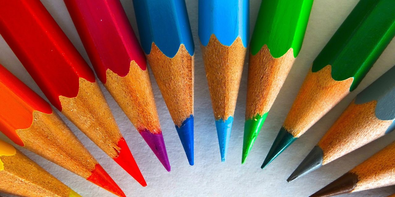
Cool colours offer a sense of comfort, neutrality and trust, and examples include blues, greens, and silver as well as neutrals like white and gray. You can add a bit of warmth too, by using a deep blue with just a touch of red (before it turns purple), or the dark navy blues that look almost black. Interior decorators have long known that a cool colour can make a room seem smaller, and the same is true in print. This means a hot colour can dominate, even if a smaller amount is used, so be careful when adding red to a blue design.
Excite and energise
Warm colours like red, yellow and orange are all associated with energy, excitement, fun and passion. Black and brown are warm neutral colours. Use the lighter side of these tones, or cool down the effect with a splash of a blue or silver.
Mix it up
Pick out a balance of colours from purple, lavender, green, turquoise and the neutrals of cream, taupe, and beige to both calm and excite in one visual cue. Be careful as this can evoke a strong reaction in the viewer. You want to make sure this reflects your particular business.
How to match
Look on a colour wheel. Colours that harmonise and work well together appear next to each other. Contrasting colours come from different segments on the colour wheel. Complementary colours can be found opposite each other on the wheel, but can often clash if used directly side by side. However, they can work well together if separated by another colour.
Check out this great article from Design Contest to learn more about colour before designing your printed materials: Color and Emotion: How Do You Choose Colors?
If you think you’re nearly prepared to begin your marketing campaign checkout out our folded leaflet design templates: How Graphic Design Templates Can Help Your Business
The PrintUK.com team can offer a lot of help and guidance when it comes to designing your business’s marketing materials, with examples of what might work best in your industry and to achieve your desired effect. Contact us today for everything from folded leaflet printing to letterhead printing.
Connect Emotionally With Your Company Colours


.jpg)
.jpg)

Trackbacks/Pingbacks