When it comes to graphic design for any commercial printing needs, one of the essential aspects that needs to be considered is colour. Colour impacts many things, including the tone of the piece, the message it conveys, and also the price.
However, did you know that colour also impacts peoples’ behaviour on a psychological level too? Studies have shown that colours have the ability to affect humans on a subliminal level, subtly modifying their responses, decisions and actions. The psychology of colour is a hot topic in the scientific world, and is becoming increasingly important in graphic design as conclusions are made.
So, how can the psychology of colour help with marketing?
1. Avoid vibrant colours
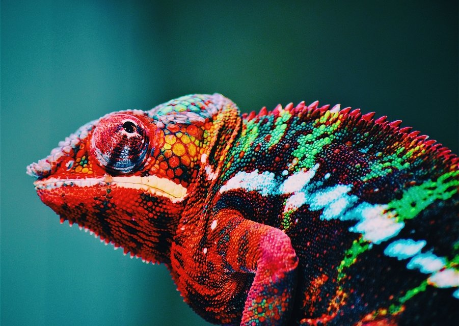
While lots of people say that bold and vibrant colours help things stand out, these colours have a significant negative association in the mind. Vibrant reds, greens, and yellows are all connected with venomous and poisonous animals, and as such are connected with danger, making people avoid them. Think about how this is used in the animal kingdom – most bright animals use their colours to show they are dangerous and ward predators away.
2. Pastels colours relax
Pastel colours help to relax people, encouraging them to react in a calming manner. This is an excellent way of promoting products or services which are meant to offer the user a positive impact on their life, anything from dog walking services to yoga will benefit. For example in brochure printing using pastel colours can be great way to get readers involved. Pastel colours should be used as the main background colour, offering subtle relaxation to the reader from the start.
3. Green is always associated with the environment
Greens are commonly associated with nature, but they are also inherently linked to the environment too. Sustainability is a key feature of many businesses, and customers want to know this. Try using a range of greens to associate your company with sustainability, and the impact will not be lost on people. And it’s not just about the colour, the shade matters too, as warm, neutral and cool colours can have a different impact.
At PrintUK.com, we specialise in high-quality printing and design services. For more information about how we can help you, speak to one of our experts at hello@printuk.com.

.jpg)
.jpg)
