
Even if your marketing content is top-notch, a poor design will put off your intended audience immediately. Before consumers actually read the words you’ve written, they’ll judge the quality of your content by its visual appeal first, so it’s essential to make sure that your design is simple, eye-catching and easy to read. To set you on the right track to marketing success, we’ve compiled a list of 3 common graphic design mistakes to avoid.
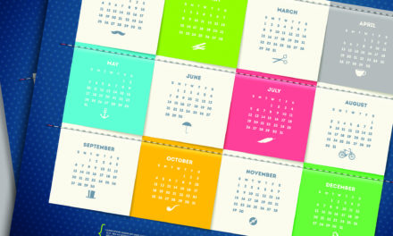
Too much colour
Instead of attracting people’s attention, using too much colour can actually serve as a distraction from the content of your design and make it difficult to read. It’s a good idea to avoid backgrounds with a solid colour behind your text as this is not only going to cost more in ink but it can also be straining on your audience’s eyes.
Failure to ‘chunk’ content
‘Chunking’ is the process by which large blocks of text are made easier to read by breaking them up into smaller, manageable pieces. Adding subheadings is a great way to implement this strategy by breaking up your text and making it more accessible to readers who tend to skim written content. By adding subheadings, you are offering readers entry points into the text by promoting its content while preventing any visual boredom.
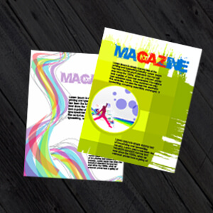
Using too many fonts
Getting creative with fonts can be fun, but for someone that’s trying to read and understand your marketing content, it can become visually tiring when there are multiple font changes in a single chunk of text. If you need to change your font, it’s recommended that you don’t use any more than three different font styles in a single layout. If you’re designing smaller printed materials, such as business card printing, it’s best to only use a single font as space is already limited.
If you’re looking for high-quality design and printing services, browse our range of products at PrintUK.com today.


.jpg)
.jpg)
