In a recent blog entry, we discussed the ways in which folder printing can be used to improve business presentations. However, if you intend to use printed presentation folders in a formal or corporate setting, it is important to ensure that they have an appropriate and visually arresting graphic design.
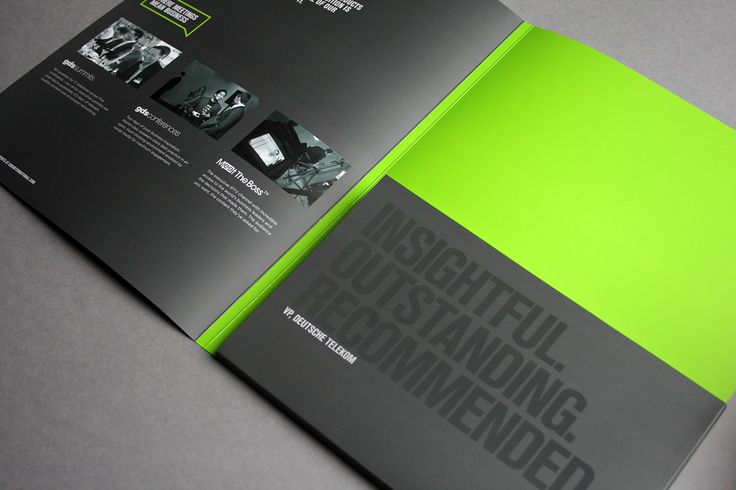
According to Creative Bloq, all printed folders improve the presentation of important documents, but the ones with “a unique, eye-catching design” are most effective. That’s why we at PrintUK.com have created three simple tips for designing folders for print that will wow your employers and colleagues in meetings and other corporate settings.
1. Keep it simple
Elaborate, ultra-detailed designs aren’t always appropriate for folders that you intend to use in the workplace. After all, you don’t want the folder design to distract attention from its important, business-oriented contents. We suggest that you focus on creating a clean, streamlined print design that reflects your professionalism and efficiency. Simple, minimalist designs tend to look more businesslike than overly complex one. However, opting for a simple design offers another advantages. The fewer elements a design has, the easier it is to ensure that those elements are balanced and that the overall design looks good. By keeping the print design simple it doesn’t mean that you can’t be creative and incorporate different die cut shapes into your folder printing that may complement the overall design and reinforce your company branding.
2. Utilise your company’s logo
If you really want to impress your boss and demonstrate your commitment to the business you work in, you should incorporate its logo into your design. If you are using your folders as welcome packs or ways to introduce your company to prospective customers its imperative to include your company logo and adhere to its relevant brand guidelines. Utilising your company’s logo will obviously make your presentation folders look more professional. More importantly, it will show that you regard yourself as part of the corporate team and reinforce the idea that the documents within the printed folder are of great value to your business.
3. Utilise pale colours
While very bright, vibrant colours can be used to add detail to your presentation folder, the background colour should be pale or very light. This will help give your design a crisp, clean look that will underscore your professionalism, whilst giving you a background that can be used to highlight the more important elements of the design by keeping them in brighter more contrasting colours in comparison to the background.
For more information check out one of our previous articles: Smarter Printed Proposals Will Grow Your Business!
Also have a look at this great article and examples highlighted by Creative Bloq: 20 gorgeous presentation folder designs
We offer high-quality folder printing here at PrintUK.com. If you’re ready to turn your ideal presentation folder into a reality, you can check out our range of folder options here presentation folders. If you’d like more information about folder printing, don’t hesitate to contact us and a member of the team would be more than happy to talk through your new marketing and print project.
A Brief Guide To Folder Design


.jpg)
.jpg)

Trackbacks/Pingbacks