
When working in graphic design, understanding colour modes is crucial to achieving accurate and vibrant results. Two primary colour modes dominate the industry: CMYK and RGB. Each serves a distinct purpose, and using the right one can make all the difference in how your designs appear in print and on screen. Let’s explore the differences between CMYK and RGB and when to use each.
What is RGB?
RGB (Red, Green, Blue) is an additive colour model used primarily for digital displays. This colour mode works by combining red, green, and blue light at different intensities to produce a broad spectrum of colours. The more light added, the closer the result is to white, which is why it is referred to as an additive colour model.
When to Use RGB
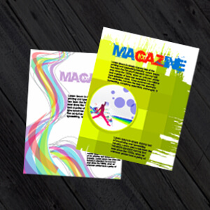
- Designing for screens: websites, social media graphics, digital advertisements, and mobile apps
- Projects that will be displayed on monitors, TVs, or projectors
- When working with images that require high vibrancy and brightness
RGB offers a wider color gamut than CMYK, making it ideal for digital designs where rich, bright colors are needed.
What is CMYK?
CMYK (Cyan, Magenta, Yellow, Black) is a subtractive colour model used for printing. Instead of adding light like RGB, CMYK subtracts brightness from a white background by layering ink. The more colours added, the darker the result, making black (K) necessary to create deep, true blacks and shadows.
When to Use CMYK
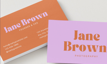
- Any project intended for print: business cards, brochures, posters, and packaging
- When working with offset or digital printing
- If colour accuracy in print is essential, as RGB colours may not translate well to CMYK
Printers use CMYK inks to reproduce colours on paper, and failing to convert an RGB design to CMYK before printing can result in unexpected color shifts.
Key Differences Between CMYK and RGB
| Feature | CMYK | RGB |
|---|---|---|
| Colour Model | Subtractive | Additive |
| Used For | Digital Screens | |
| Colour Gamut | Narrower, less vibrant | Wider, more vibrant |
| Black Representation | Uses a dedicated black (K) ink | Combines red, green, and blue to create black |
| Appearance on Screen | Duller compared to RGB | Bright and vivid |
How to Convert RGB to CMYK
When designing for print, it’s essential to convert your files to CMYK before sending them to a printer. Most design software, such as Adobe Photoshop, Illustrator, and InDesign, allows you to switch between colour modes. However, because RGB has a wider gamut, some highly saturated colours may appear muted when converted to CMYK. Testing with soft proofs or printing sample swatches can help prevent unwanted surprises.
Final Thoughts
Understanding the differences between CMYK and RGB ensures that your designs appear as intended, whether on screen or in print. While RGB is perfect for digital applications with vibrant colours, CMYK remains the industry standard for high-quality printed materials. By using the right colour mode for the right purpose, you can maintain consistency and accuracy in your work.
When preparing a project, always consider the final output—screen or print—and choose the appropriate colour mode accordingly. Doing so will help you avoid costly mistakes and produce professional-looking results every time.


.jpg)
.jpg)
