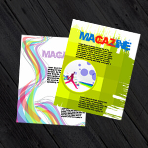
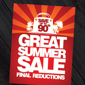
A postcard, long used as a a popular printed marketing item across the world: [http://www.businessknowhow.com/directmail/postcards/success.htm.is]
Postcards are one of the most versatile and useful print items that you can have as a business. They tend to come in standard print sizes i.e. A6 and A5 which makes them easy to source when you’re looking for cheap printing. They’re also an easily acceptable format to customers, as they have the advantage of being personal so you’re far more likely to get a higher response rate from your marketing campaign with a printed postcard than sending an email. They’re also big enough to fit a reasonable amount of text, so you have room to introduce yourself and outline your services, but not so much space that you feel like you have to write an essay.
Use the space wisely and you will have one of the hardest working pieces of print media possible!
Postcard Design: Side one
Use the first side to grab your customers’ attention. Make sure your company name and logo are prominent, so it’s immediately clear who you are. Remember, despite this being a small printed postcard you need to carry your company branding strongly through the creative aspect as all branding should be consistent throughout your marketing campaigns despite the outlet medium i.e. social media, print media, signage etc… You might want to add some immediate contact details, such as a website, Twitter handle or phone number, but save lengthy information for the reverse of the postcard. In regards to designing your postcard you need to choose a big, bold image that will catch the eye; this could be something that immediately identifies what you do, but it’s also an opportunity to think outside the box and draw your potential customers in. For example, a kitchen designer may wish to show off a high end luxury fitting, or an artist may wish to highlight an intricate detail of their work. Think colours too; choose something bright and colourful, or more monochrome but with an accent colour but always keep it inline with the companies branding guidelines.
Postcard Design: Side two
The reverse of your postcard can act more like a traditional flyer or brochure. It works well if you divide it into thirds. Dedicate some of the space at the top to text introducing yourself in a little more detail, explaining your product range or the services that you offer – but keep it fairly brief, and remember to add a call to action i.e. use this voucher code or RSVP to this email address. The aim of the game is to illicit a response from the recipient and get them to actively engage with postcard and its message. The middle area of the postcard is good for displaying more creative images, letting you showcase more of your products or illustrating your services. These images will be smaller than the main one you have used on the other side; captions are a good idea to add more detail or explanation. Use the bottom third of the postcard to establish where to find you – either literally or virtually! An address and a phone number for a shop and a website and social media address for a virtual business will do.
Now you’ve taken all that on board, let PrintUK.com help you with your postcard printing and design to create a highly impactful marketing campaign that gets results.
How to Design and Layout your Business Postcard


.jpg)
.jpg)

Trackbacks/Pingbacks