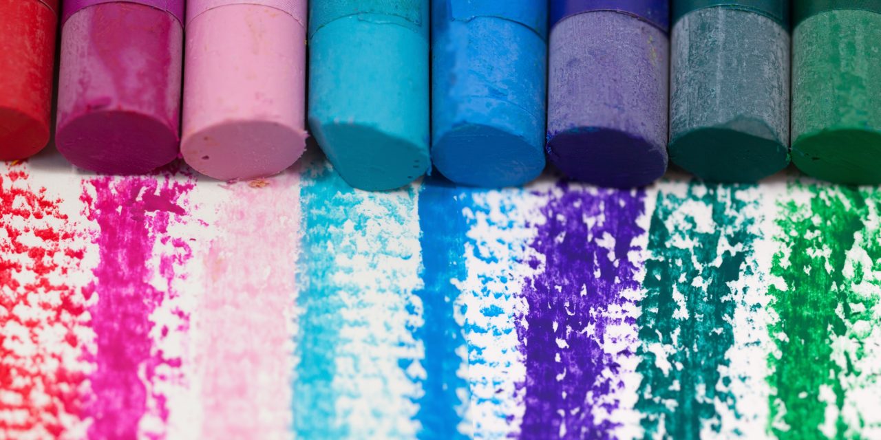
Colours are inspirational and can do many things in business, from conveying company values to stimulating action. Today, we will be examining the effect of colour in design, and showing you how to use colour in your printed leaflets or brochures to get your message across :
Red
Typically, we think of red as conveying danger, urgent or stop, but it can also be used positively to help your business. If you’re sending out flyers or booklets to clients, a red background will get their attention immediately. This is handy for new clients, as they will see the red piece of paper in amongst their other post and will be immediately intrigued. It is also linked to passion and power, and as such is a very energetic colour to use in print, particularly if you want to stir emotions in your reader to act on your message.
Blue
Blue is traditionally a calm, fresh colour but is also used by companies such as banks because it imparts a feeling of trust. If you are a large company, print all your materials in blue as the clean finish will look extremely professional and convey the sense that your company is well run and well organised. Blue is also a great neutral background if you want to print photos of your products, business or staff. A pale blue will help your photos stand out and is far less jarring than white can be.
Yellow
Yellow is a cheerful colour and is perfect for sending out brochures or leaflets advertising holidays, special deals and discounts or other positive messages you want to convey to customers. Go for a bright yellow to immediately grab your customers’ attention, or go for a pale yellow to give your company prospectus a professional finish that will impress major clients.
Getting the balance right
These are the three primary colours of colour theory, but you can play with and mix these to get nuanced shades or secondary colours that work for your particular company and mission. Designers also find that colours opposite each other on the colour wheel work well together for impact, such as red and green or blue and yellow. Being subtle with your colour choice is often recommended as an overemphasis on one strong colour can make your print look low quality and put readers off.
PrintUK.com specialises in high-quality printing and graphic design. We allow our customers to personalise their projects and make it as easy for them to achieve amazing, professional effects through the use of design templates, specially designed by our experienced graphic designers.
Want to know more about graphic design and what can make your business stand out? Find out the latest graphic design trends on our blog [https://blog.printuk.com/2018/01/22/3-graphic-design-trends-that-will-shape-2018/].
The Effect of Colour in Design


.jpg)
.jpg)
