
One of the most effective ways to quickly draw your audience’s attention towards printed content is utilising colour in the right way. The following three tips aim to help you make the best decisions when it comes to using colour in the design stage before you start printing.
1. Select the right colours
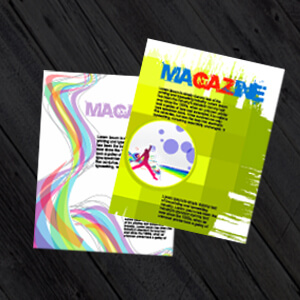
Regardless of the different shades and tones you may edit into the piece later, it is important that the initial colour selection works for what you are trying to achieve with your printed piece. Consider the message you’re trying to get across and take some time to decide on what colours work best for this. For example, red can symbolise passion, blue can symbolise trustworthiness and yellow can symbolise exclusivity.
A lot of research has been done into the psychology of colour which can be very helpful as a guide while you make your decision. Different colours have different connotative meanings. This is why the colours you select can have an impact on the audience’s interpretation of your printed piece, regardless of your creative intentions.
2. Combine the right colours
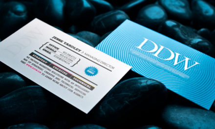
Getting the right combination of colours on printed materials is crucial as the wrong combination can make your material visually unappealing. In any product that is to be distributed among customers, it’s important that the colours complement each other (e.g. blue and yellow, black and orange, dark purple and blue, pink and brown). This will draw positive attention to what you’re trying to say as well as your brand or organisation as a whole.
3. Adapt these colours for the print medium
With our high-quality printing methods, it is easy to make any colour you select look good within the finished product. It is important to remember though, that even with this, there are certain colour formats that work better within a print context than others (e.g. CMYK, or Cyan, Magenta, Yellow, and Key).
It can be easy to get carried away within the digital design stage and forget to consider how these colours may come out in their printed form later on. Taking the physicalities of the print medium into account is essential within the content planning stage, even if this is fully digital. It might be a good idea to have samples of your colours printed during this stage to help you visualise the final product.
For more on colour in design and the importance of high quality printing, check out our blog. PrintUK.com/Blog
Whatever you plan on printing, whether it be leaflets, business cards or posters, we can help you make your choice of colour and content stand out among the crowd. Visit PrintUK.com for all your cheap printing options


.jpg)
.jpg)
