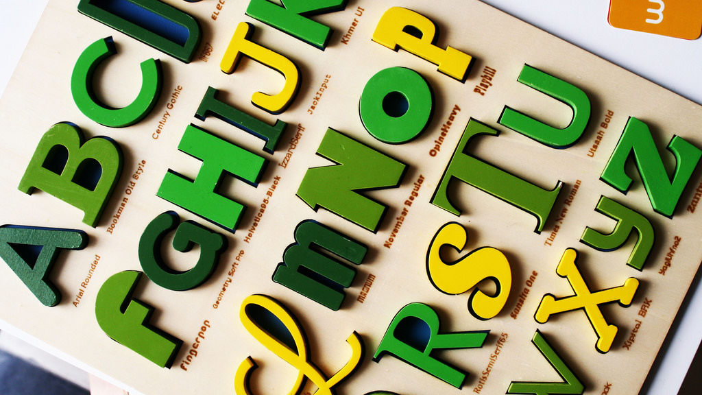
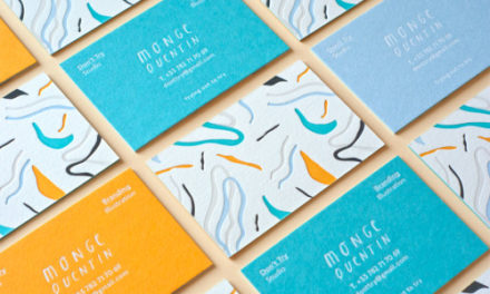
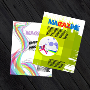
There’s no denying that printed media can be a powerful tool for promoting and marketing your business. Business cards allow you to make a good impression on potential contacts in the business world, while brochure printing enables you to grab prospective customers’ attention. Leaflets and flyers are a great way to convey your core USPs and brochure printing is an unbeatable format for explaining your business in-depth. However, there’s one thing that you have to get absolutely right if you want to make a real impact with any form of printed media: the font. It might seem strange, but your choice of font can make or break your printed marketing campaign. Hence the creation of an entire field of study: ‘Typography’. Typography is the art and technique of arranging type to make written language legible, readable, and appealing when displayed across varying formats and mediums from print to digital.
According to the ‘Design School’ section of the Canva website: Font Design, the font you choose for a piece of media helps to create that “first impression that people gauge and judge the rest of the design by – so your font choice needs to be purposeful and appropriate.”
But how can you choose the perfect font for your business’s printed media? There are three simple factors that you need to consider.
1. Personality
Each font has its own character and projects a different mood or vibe. Some fonts are friendly and approachable, while others are serious and respectable. Some are stylised and evoke an air of glamorous sophistication, while others are just plain fun. Think about your brand identity and the kind of mood you want to create and choose a font whose personality matches that of your brand.
For example, if you run a legal firm, you should probably choose a sturdy, classic, dignified font, like ‘Times New Roman’ or ‘Bookman’. If you’re running a nightclub or other high-energy business, you might like to choose something with a little more pizazz, such as ‘AR Bonnie’. If you run a small business designed to meet the needs of ordinary, local people (such as a corner shop or barber), you’re better off with a simple, likeable font such as ‘Calibri’ for your print media.
2. Legibility
It’s important to choose a font that will be legible when you use it on printed media such as printed brochures or leaflets. Some fonts are perfectly legible when they are printed in a large font-size, but are too elaborate to be read when printed in a more normal size. For example the font ‘Excalibur’ is incredibly complex and looks great when used for just one or two words (as might be the case on a business card or the main title of your brochure), because it can be printed in a reasonably large size. However, if it is shrunk down to normal textual size, it becomes very hard to read. Ergo, it can’t be used for blocks of text. Choose a font that will be readable at the size you intend to print it.
3. Size
It’s imperative that you consider the size of your font during the graphic design phase because the size of font needs to drastically change from one medium to the next. For example the font on a poster or billboard needs to be particularly large, because it will need to be read from a distance and needs to convey its marketing message quickly and easily as it’s targeting prospective customers through footfall passing traffic. Whilst on the other hand its unnecessary to have such large font on the likes of a website *(unless the site is targeted to a niche segment i.e. the elderly) or newspaper, because people are studying the medium for a longer period of time and up close. So ensure that you adapt your font accordingly to meet the requirements of the marketing medium and target audience.
4. Compatibility
Any font you use should work well with other aspects of your printed media’s graphic design. If you have a leaflet or brochure with a sophisticated, old-fashioned design, you shouldn’t use a futuristic font like ‘Bolts’ on it, for example. Always consider your overall graphic design when choosing a font type.
5. Where to Find Fonts
Figuring out how to effectively use the correct fonts in your marketing is a learning process and is usually only mastered through trial and error. If you’re looking to embark on a creative adventure and test varying fonts have a look at these fantastic resources: google fonts, font squirrel , 1001 fonts, Dafont and fonts.com. Keep in mind that typography and fonts have specific licences regarding their copyright similar to stock photography so ensure that you double check its usage rights before implementing the font into your marketing materials.
Ready to start? Just before you do it might be worth checking out one of our previous articles: Branding Your Business with Printed Marketing Materials
We offer cheap printing for a huge array of paper-based marketing material here at PrintUK.com and we can accommodate almost any choice of font with our integrated design templates on our website. Check out our range of popular products at PrintUK.com today, if you can’t find what you’re looking for please get in touch and a member of the team will be more than happy to help.
The Power Of Fonts


.jpg)
.jpg)

Trackbacks/Pingbacks