Every marketer is aware of the importance of appealing directly to their target audience. By creating content that is interesting, unique and easy to digest, marketers can pass on their key messages and encourage people to commit to a purchase.
But did you know that the colours you use have a huge role to play when it comes to enticing people to back your brand? In fact, research from Emerald Insight has found that approximately 90% of people’s initial opinions are decreed by colour on its own.
We subconsciously associate different traits, characteristics and relationships with particular colours, so it’s absolutely essential that you represent yourself in a way that is most appropriate.
So, with that in mind, let’s take a look at the power of colours.
Blue
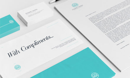
Blue, given its inherent associations with the sea and the sky, is closely linked with serenity and calm. Blue is also a colour that many psychologists believe has close ties with trustworthiness and openness, which is one of the reasons why large social media brands such as Twitter and Facebook use blue throughout their branding.
Green
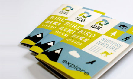
Green is the colour of nature. Organisations such as Greenpeace, WWF and Whole Foods, all of which have built their brands on being sustainable and environmentally friendly, utilise the colour green throughout their marketing materials. Research from the US National Library of Medicine National Institutes of Health has also found that green is the easiest colour for human eyes to process. (Article: The Influence of Colour on Memory Performance: A Review )
Red
Red is the colour of power and, traditionally, anger. However, in this era of fast-moving media and digital dominance, red signifies excitement and a willingness to do things differently. Just consider some of the brands that harness red throughout their branding: Red Bull, YouTube, Coca-Cola, Disney and McDonald’s, for example. Red draws the eye and showcases the boldness of the brand using it. Red has always been associated with a promotional Sale, because it draws attention therefore you’ll notice how businesses use red in their promotional materials to help illicit interest from potential customers passing by.
Purple
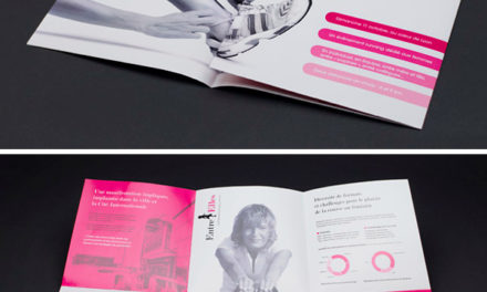
Purple is a colour that has very close ties to royalty. If your brand is appealing to an audience that tends to spend a lot of money on a purchase, then purple may be the best choice for you. Some of the brands that already utilise purple heavily – Cadbury, Hallmark, Asprey and Zoopla – are somewhat decadent and high brow, and purple suits their needs well.
Your promotional materials from online advertising and billboards all the way through to your brochure and folder printing needs to take into account the affect of colour and use it to entice the action that you desire from your potential customers, from making a purchase or merely boosting brand awareness.
If you’re looking for high-quality printing and graphic design services to help your business and ensure that you’re using colour for competitive advantage, get in touch with PrintUK.com today.

.jpg)
.jpg)
