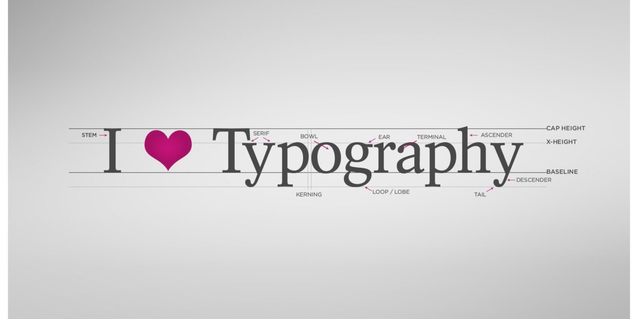
One important element in the graphic design of your company marketing literature and website is the font that you choose. Here are some tips on how to select the right font for your business.
Why font matters
The style of font that you choose should reflect the image of your business that you want to portray to your clients and prospects. For example, if you run a technology business, a blocky, futuristic-looking font could work well.
The font you select can also affect the readability of your printed material and of your website content. For example, a fancy, curly font might look nice, but it could be really hard to read if used for the body text of a brochure, so keep this type of font for use in headings only.
Considerations when choosing fonts
In general, choose a larger font for your headings and subheadings to break up the content and use different fonts to make it look more interesting. Heading size should be kept in proportion to the body text so that you don’t overshadow it. Stick to two types of font as more than this can make your material look amateurish.
You’ll need a larger font for your online marketing presence so that it can be read easily on mobiles and tablets.
Using colours
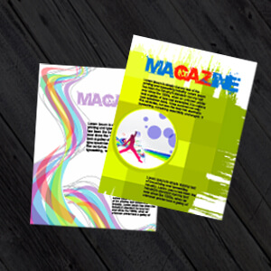
Although colour can be very effective in your company literature and on your website, it’s best to use it sparingly and consistently to keep everything looking professional. Regarding designing for print, this wants to be consistent with your website design and branding so we recommend for uniformity and ease that you use one colour only for the text and another colour for the headings especially for your brochure printing and design.
Use a dark colour on a light background to create a good contrast that is clear and easy to read, remember in commercial printing your design is being transferred onto a paper substrate so the pulp of the paper and the ink will adapt the colours slightly from what you’ve produced on your computer. The reason being that your computer screen shows your designs in RGB (Red, Green, Blue) whilst lithographically and digitally we print in CMYK (Cyan, Magenta, Yellow and Black). With this in mind we want you to make your graphic design legible to the reader so use dark type on a light background and conversely, light coloured text against a darker background can work too, but it’s best to use this approach in moderation as too much pale coloured text can be difficult to read.
In conclusion
Choosing the right font for your printed corporate material and website is important, especially if you decide to take the DIY graphic design route.
For more advice or to find out more about a bespoke printing and graphic design service, contact the experts at PrintUK.com
Typography: The Importance of Typeface (Font) in Marketing


.jpg)
.jpg)
