
Information overload is the scourge of good print design.
Think about the kind of printed flyers, leaflets and menus that people get through their letterboxes. They’re often cheap, loud and brightly coloured – all of which is perfectly fine, since it’s a flyer’s job to attract attention and inform their reader quickly (and affordably) of important offers and services.
But the problem really arises when printed leaflets and flyers abandon the principles of good design, and instead become a messy free-for-all of words and pictures. That’s where the structure of good print design can make all the difference… and crucially, where less really can be more. Especially in terms of the potential return on your print-marketing spend.
So let’s take a closer look at some of the key principles behind better, more streamlined print design – whether you need cheap printed flyers or professional business cards, or any type of print in between.
Information hierarchy
This is the central skeleton of any piece of print design. It describes any design choice that helps to lead readers’ eyes (and minds) through the information your print contains. This could include your choice of effective, attention-grabbing font (typeface), the size of various type elements altogether (allowing names and offers to take precedence, before the finer details underneath), and even the size and placement of imagery and motifs to help guide the reader’s gaze down and across your print.
Apply the sales process of AIDA to your print design, and its information hierarchy, and you’ll become keenly aware of the prints that really do work harder for their brands. Attention, Interest, Decision, Action – it’s the vital blueprint of sales.
Visual noise
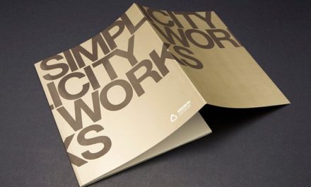
Whether you’re using booklet printing, menus, leaflets, flyers, business cards or vinyl banners, they all serve the same purpose. They should be lean, mean selling machines – without a shred of unnecessary info taking up space and diluting your reader’s attention. Don’t fall for the false economy of packing everything into your prints, just to “get your money’s worth”. In reality, the most effective ads are incredibly simple and stripped back, and have the calm confidence to go with one message, one offer, and one big, beautiful image to really sell the sizzle of your goods or services. Crucially, a simpler print design can be set out larger on the print space – making it easier for people to read, and act on.
Gone are the days of thumbnail photos: modern digital printing offers you perfect image clarity even at full-page sizes. So, rather than have your full menu on display, using lots of tiny images that readers have to squint at… instead go with one full-page closeup of your signature dish – with an HD photo your readers can practically taste. When in doubt, look to the photos that dominate social media: there’s an exact science to those crowd-pleasing shots.
Learn from the best
Think about the world’s best-known brands. Think about what’s printed on their boxes, and wrappers, and cups. It’s often extremely minimal design, which puts as much focus and impact on their logos as possible. These brands make a lot of noise, and they do it big and bright, especially in their print marketing – but they do it with a strict focus on a calm, clear, confident and singular design. For the very biggest companies, all we’d need to see are their logos and a single brand colour to recognise them in an instant.
That’s the raw power of a brand that understands the use of effective, stripped-back design; whether online, in broadcasting or in print. And, if we recognise that brand, and we trust it, then we’re also more likely to buy from it when the need arises. In essence, the best brands are the most trusted brands – and they achieve that trust partly by wielding the power of very simple, yet hugely impactful, print design. Put simply, great print design recognises its stripped-back visual appeal. That appeal speaks for itself – and plays a huge part in making those sales.
We hope this post gives you some helpful pointers for your own print design! Whether you need printed business cards, flyers, brochures or vinyl banners, we’ve got you covered from initial design right through to the finished items. You can take a look right here at our bestsellers , or click here to speak with our friendly team of print experts.
With decades of combined printing experience, we’ve worked with household brands and organisations like the NHS, Salesforce and L’Oréal Paris – designing and printing everything from folded flyers to banners and high-end business cards.
Check out this article by Michael Brenner on Marketing Insider Group: WHY LESS IS MORE FOR CUSTOMER EXPERIENCE IN 2018
Click here for even more handy print articles, or right here for our full range of products and services) – all expertly crafted to help turn your readers into customers, using simple, effective, high-impact design. Contact the team at PrintUK.com for high quality printing.


.jpg)
.jpg)