When it comes to printing, design and layout usually steal the spotlight—but the paper you choose can make or break your final product. The right paper stock doesn’t just support your design; it enhances it. From business cards and brochures to posters and packaging, each project has unique requirements that call for a thoughtful paper choice.
In this guide, we’ll walk through everything you need to know to select the perfect paper for your project.
1. Consider the Purpose of Your Print Project
Before you look at paper specs, start with the big picture:
- Marketing Materials (flyers, brochures, business cards): Durability and professional appearance matter most.
- Invitations & Stationery: Texture, elegance, and tactile quality take center stage.
- Posters & Signage: Visibility, ink absorption, and resistance to wear are key.
- Packaging: Strength and weight should be your top priorities.
The purpose sets the foundation for every other decision.
2. Paper Weight: Understanding GSM
Paper weight is measured in GSM (grams per square meter). The higher the GSM, the thicker and sturdier the paper feels.
- 80–100 GSM: Standard office paper; great for everyday documents.
- 120–170 GSM: Light but professional; common for flyers or letterheads.
- 200–300 GSM: Thick and premium; often used for brochures or posters.
- 300+ GSM: Heavy stock; ideal for business cards, postcards, and packaging.
Think of GSM as the backbone of how substantial your print feels in someone’s hand.
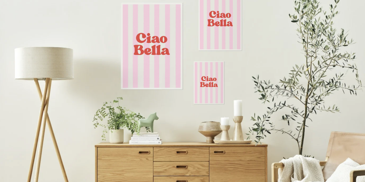
3. Paper Finish: Glossy, Matte, or Uncoated?
The finish dramatically impacts both the look and feel of your project:
- Glossy Finish: Shiny, vibrant, and perfect for high-impact visuals like photos or colorful designs.
- Matte Finish: Smooth and elegant, with reduced glare—ideal for text-heavy projects or premium branding.
- Uncoated Paper: Natural, tactile, and easy to write on—great for stationery, notepads, or eco-friendly brands.
- Silk/Satin Finish: A balanced option that’s not too shiny but not completely flat.
Your finish should match the mood and function of your project.
4. Colour & Brightness
Not all white paper is created equal. Brightness affects how colors and text appear. A higher brightness level makes colours pop, while a warmer tone gives a softer, more organic look.
Tip: For projects with a lot of images, go for brighter paper. For something formal or traditional, an off-white or cream tone can add sophistication.
5. Specialty Papers for Standout Projects
If you want your print to feel truly unique, specialty papers can take it to the next level:
- Textured Papers: Linen, felt, or laid textures add depth and personality.
- Recycled Papers: A sustainable choice that communicates eco-conscious values.
- Metallic or Pearlescent Papers: Perfect for invitations or luxury branding.
- Waterproof/Synthetic Papers: Durable for outdoor signage or menus.
6. Budget Considerations
While premium paper stock elevates your design, it also impacts cost. A good rule of thumb is to invest in higher quality for materials that represent your brand (like business cards) and choose mid-range options for larger, high-volume runs (like flyers).
7. Always Ask for Samples
No matter how much research you do, nothing replaces physically feeling the paper. Request samples before committing to a large order so you can compare finishes, thickness, and print quality firsthand.
Final Thoughts
Paper isn’t just the surface your design is printed on—it’s part of the design itself. The right choice can make your materials more memorable, more durable, and more effective. Next time you plan a project, take the time to match your design with the perfect paper. Your audience will notice the difference. PrintUK.com


.jpg)
.jpg)